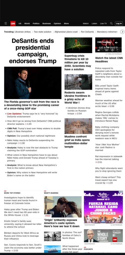
I chose CNN.com and Amazon.com as my two websites to critique. The CNN website uses proximity to display a variety of articles. Most article titles are in bold so that they stand out more. The website also uses symmetry for balance. I do not like the overall design. There is a lot of information on the page. I will say that it does remind me of the front page of a newspaper. The design does effectively communicate that this website has a plethora of news to report. There is breaking news with the time next to it, showing that this information is recent. I would put less information on the page. The website is just too cluttered for my liking. I think the information should be more categorized. I would suggest focusing more on the kind of news to report.
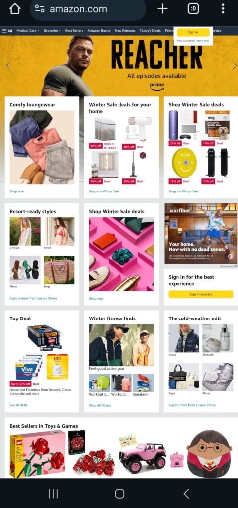
Amazon.com uses proximity and symmetry as well to display the different items they carry. Items are grouped into categories. The website is well-balanced. For example, the search box is well balanced in between the navigation buttons. Overall, I feel excited when I see this design. I want to browse the website to look through the items that are being sold. There are a lot of squares, especially within a larger square. I want to explore and look at the images because they are small squares. I feel like the design of this website clearly communicates that this website has a lot of useful and trendy items to sell. I do like the design of this website; it is very bright, colorful, and eye-catching. To elevate this design, I may suggest less items on the page.


Leave a Reply